Friday, 2 October 2015

Advertising - Image bank

I like this surreal style of photography involving the ingredients of food and the outcome. The cheese grater is an extremely clever and fascinating tool used to convey the past and the present. Having somebody grate cheese and then having goldfish cheese crackers falling out the bottom looks as though they are being grated from the cheese. This compliments the slogan "baked with real cheese" because it is visually evident that the slogan is correct. It's also a fun photograph and is interesting to look at instead of just photographing a group of goldfish cracker packets for example. The surreal approach is admirable and inspirational. The overall photograph has been constructed well and the formal element colour has been grouped with complimentary colours; they have an autumn theme - khaki, burgundy and mustard - which could convey how they are the perfect snack for the colder weather or that they are being released this Autumn. Many different interpretations of connotations could be made through the use of the colours in this photograph which is why it is my most loved formal element.
This photograph has humorous elements involved in it through using the shapes of certain popcorn as people with their arms up holding a jar. There is half of a bowl of popcorn in the left hand side of the frame to compliment the white cheddar seasoning in the Club House packaging. The beige and light yellow colours all mix together successfully as these are the colours of popcorn along with white cheddar cheese; so this formal element has been used effectively in this piece. The top of the jar is being carried towards the bowl of popcorn; this represents the contents of the jar being the toppings for the bowl of popcorn. If it was being carried the other way the photo would appear less inviting. There is an intense blur surrounding everything but the popcorn and Club House jar allowing for these features to stand out as these are what's being advertised in the frame. This photograph is a cropped version of a whole magazine page and in the un-cropped version there is a slogan at the bottom of the page which reads "popcorn prefers Club House" which portrays this brand as being the perfect toppings for a light enjoyable snack. The picture advertises a certain flavour of the brand whilst the slogan advertises all of the flavours; which is a clever technique used to get a message across to an audience visually and verbally.

This is a beauty photograph advertising Clinique chubby sticks in a variation of pink tones. There is a plum colour, hot pink, light red and cherry pink. These lip products have been scattered in the frame, flying solo and doubling up on top of each other. There are then some macaroons surrounding the chubby sticks that appear to be the same colour as some of the lip products. The macaroons have a glossy effect on their top layer to match the glossy glow on the balm of the chubby sticks which exaggerates the overall glossy appearance in the picture. This is effective because the photograph looks attractive and feminine, as it should. There aren't as intense shadows beneath the products and the white background is bright, suggesting that high key lighting could have been used to add to the flattering appearance of the picture. The bold colourful colours in this photograph could have the connotation of how make up products can bring colour to your appearance, literally and mentally. If someone has a bright lipstick on, they'll feel bright on the inside which can affect their mood. This could then link to the bright macaroons as being a physical example of how to feel bright on the inside; eating the confectionary in this piece. I also like this photograph because it doesn't just advertise one thing, but two things in one piece - which is something I want to do in my project rather than focusing on one topic. 
This is another extremely interesting piece of photography that I found online featured in a magazine. It again has a white background in order for the bright red Doritos packet to stand out in the centre of the picture. The flavour on the packet reads "nacho cheese" which is part of the mexican food family just like Tacos; which is the item of food coming out of the Doritos packet. All of the colours in this piece; red, orange, yellow, red and green, all blend effectively together. The "NEW!" featured at the top right of the picture is in blue writing in order to be one of the first thing the audience look at as it doesn't blend in with the rest of the image. The surreality of the tacos emerging from the open Doritos packet look as though this is the outcome of opening the packet; the crisps have the potential to create a tasty Tacos lunch. It could be an ingredient for the tacos, or it could be tacos flavoured crisps. I can't make an accurate observation of the photograph which could perhaps be a negative when it comes to advertising photography as it could confuse the audience, however the overall interesting appearance of the tacos emerging from the crisp packet is inspirational for me. 

This is a perfume advertisement I found in a magazine online. The perfume is called Amouage, and it has a slogan to go with it - "fragrances that pay tribute to the art of perfume making". This slogan would match effectively with the appearance of this advertisement, as there are clouds of multicoloured powders circling around the top of the bottle. They look like watercolours mixed together without being blended, which would emphasise the word "art" in the Amouage slogan. Amouage calls the fragrance a chypre oriental with a "rich floral heart intensified by a dark and destructive accord resonating with the tumultuous unknown". Its top notes include bergamot, cinnamon, chilli and pepper; its heart includes rose, narcissus, jasmine, frankincense and labdanum; and its base notes include vanilla bean, frankincense, benzoin, castereum, patchouli, oak moss and leather. This combination of smells mixed up in this product would explain the mixture of colourful powders included in the advertisement, as it can be viewed as being visual evidence of what the insides of the perfume could look like if it wasn't mixed into a liquid. The colourful appearance would immediately attract an audience, and the slight reflection beneath the bottle is delicate which makes the packaging and overall image flattering. Formal elements have been used in this photograph to create a unique and successful advertisement; colour, pattern, shape and reflection.

This is a photograph of Venice called "The Bridge of Sighs" which has been taken directly in the centre of the bridge in order to create a sense of depth in the image. Selective colour has been used in this photograph which is a technique people explore when they want a particular element of a picture to stand out and be the focal point of the piece. The red boat amongst the black and white surroundings convey the method of transport people have to use when travelling around Venice, as it is on water. It is known by several names, one of which is the "Floating City". This is due to the fact that the city of Venice consists of 118 small islands connected by numerous canals and bridges. Boats replace cars in this location which is a very different and unique way to travel in comparison to the norm. If this picture was used to advertise Venice, then already the audience would see the beauty of the city, know how to travel in it and get a taste for what they could explore whilst on a boat. It is a beautiful piece of photography and instantly captures the stunning scenery and individuality of Venice; perfect for being used for advertising.

Monday, 28 September 2015

Advertising - Definition post

Dictionary definition: The activity or profession of producing advertisements for commercial products or services.

Describing words:

Inform
Fun
Interactive
Convey
Appealing/Attractive
Captivating
Research
Interesting
Imaginative
Ideas
Visionary
Seductive
Knowledge

In this photograph, a surreal approach has been adapted to the piece.  I like the photo manipulation technique here because it has a fresh and photogenic appearance. The orange having the top of a can attached to it conveys that the contents of the drink is pure orange juice, or the drink has been completely made out of oranges with perhaps a slight add of sugar. The beginning of the drink is being poured out into a glass, advertising the actual contents - which is clear orange liquid that immediately looks mouthwatering for the viewer. I like the contrast of the bright orange colour against the whole whit backdrop. This allows for the orange to be the focal point to the viewer. This picture is inspirational to me because in my previous project I explored photo manipulation techniques, which actually involved fruits. Looking at this style of photography this year encourages me to explore and develop the topic further. This picture would be advertising a fresh beverage to be consumed during the Summer perhaps, even though it could totally be drunk throughout any season. However, it could be suggested that the connotation of orange represents warmth and summer in general, which makes it a perfect drink for the hot weather; and I want to focus my images around bright, colourful and interesting images - which would include a lot of treats that could be associated with Summer.
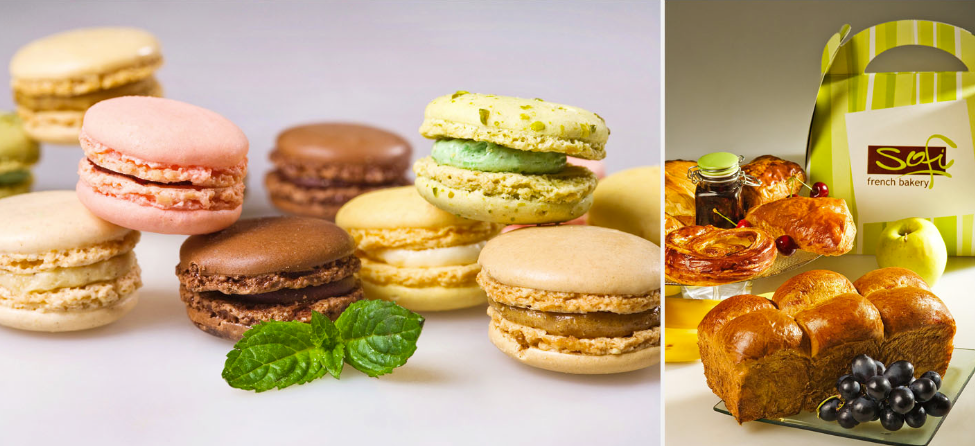
This photograph is advertising sweet treats from a certain company known as Sofi French Company.  Two images have been put together in the same piece, both in different frames. I like this technique because it allows for more than one thing to perhaps be advertised in one image if a company was limited to just one space in a town to advertise; they may want to advertise more than one of their products. This technique is interesting, and encourages me to perhaps create pieces like this also. The picture on the left of the macaroons has been composed well, with a variety of different coloured treats all situated in a landscape style in the frame. They are sat on top of each other in a peaceful way; the frame isn't overcrowded. They look extremely yummy with the clear defined outer coating and creamy filling; which has been over exaggerated with the use of perhaps high key lighting. Then the picture on the right involves more bakery types of food, varying from bread and pastries and fruits. This image has been composed from the back to the front, the bread being in front along with the grapes. The green packaging of Sofi's bags matches effortlessly with the green apple and subtle brown tones in this image. I like this portrait picture because it's advertising a whole set of breakfast foods instead of a jumbled up group of one thing. The overall left and right image as a whole is a successful photograph and something that holds much potential for inspiration in  my project.
In this photograph, it has a different approach in comparison to the above food and drink style images. I have looked at this image because it is evident that a holiday home/villa is being advertised in this piece. A woman is looking out across an infinity pool towards the sea, with which the colours of the pool water and the sea water blend together as if there isn't anything in-between them. The picture has been composed beautifully so that part of a tree is situated in the left side of the frame, corresponding with part of the actual holiday home in the right side of the frame. The space in the frame has been put to good use which results in this image being a successful piece of photograph. The sunny glow on the woman's body is also an attractive element in this picture, because it compliments the nearly cloudless sky - illustrating how this holiday home is located on a a warm sunny beachfront. I have captured many holiday and travel style photography for this project which I will continue with as I explore more areas. I enjoy being able to capture an attractive landscape/location which looks bright and beautiful enough to perhaps be included in a holiday brochure. I don't want to just be advertising food and drinks in this project, even if it will be a large portion of my work - I want to have the freedom to capture many different images in order to advertise many different things.
Make up is also a topic I think I would enjoy photographing in this project also. I like the different things you could do with make up e.g. decorate someones face, eyes, lips etc. and also shrink people in the frame to be the size of a mascara wand perhaps; have them leaning on a standing mascara wand. These are all interesting and creative ideas I could explore through looking at this sub-topic in my project. I like the appearance of this photograph above because it almost looks as though there's a slight fish eye approach around the blushed brush. It is larger in the frame and dominates the rest of the beauty products surrounding it. Texture is evident in this piece through the bristles with pink at the end of them, and is again apparent in the mascara wand at the bottom right hand side of the frame. This formal element would be extremely effective in make up photography because many different make up applying products have a lot of texture. I like the theme of pinks and oranges mixed with the black, grey and white colours in this picture because the pop of colour is effective as it differs the bare brushes and wands to the powdered brushes. This pop of colour could have the connotation of make up being something that brings life to things and creates a bolder and brighter appearance to what it is applied to.
Real example: (magazine pages)
My definition: Advertising is the technique used to attract a customers attention towards a certain product through a variety of mediums such as TV, magazines, radio stations and social media.

Advertising - Mindmap


Sunday, 27 September 2015

Project Proposal

I would like to work in advertising for my project. I want to explore photography that is surreal, creative and bursting with colour and imagination. After exploring surreal photography last year, it is definitely something I want to develop further in this year as I found the photoshop editing process of photography to be the most enjoyable. Below I have included some influential work that I have found: 
In all of these pictures I have looked at the composition of the subject and admired how everything in the frames were positioned. With the Coca cola one, it's the splash and pouring of drink that I want to develop in my project - I want to capture objects falling into jugs of water for example and capture the splash to add to the fresh appearance of the product I'm advertising. With the Nesquik one, I like that fellow breakfast foods have been placed near the cereal box e.g. a bowl for the cereal to go in and a bowl of grapes. I will add companions of my product into the frame when I photograph something to emphasise the finishing touch. With the left and bottom photographs, it's the surreal element of them which caught my eyes. They both look interesting and creative which are two factors I'm aiming to include in my work. With the top right cake photograph, I like the soft setting to match the soft sponge cake as it makes the overall piece look extremely effective. The out of focus candles in the distance add to the softness of this image, and I want to be able to photograph sweet treats in the same relaxed presentable way. 

Below are some more pictures I found that have inspired me for this advertisement project; as I of course don't want to just focus on food, but also explore topics such as art, reading, beauty, candles, perfumes, seasonal things etc; anything that can be photographed and advertised to the public through social media, magazines, newspapers and websites. 
I am going to approach this project with, as I mentioned previously, a surreal and creative technique. I want to capture fun colourful pictures created through mostly photoshop techniques. I will explore and devlop my photoshop skills from last year, and improve them this year. I will mainly be looking at sweets/snacks/food/cakes/drinks etc because I have many ideas for these topics; but also exploring many other topics that can be photographed through 'advertising'. I will be doing normal shoots where I just take photographs of things, and also shoots where I create the picture through photoshop techniques. To set myself up for the beginning of this topic and make a start on my ideas, I will be looking at photographing just close ups of sweets so that they fill the frame as I think this is a good starting point, and then I will create more interesting pieces through developing the sweets I use. 

Tuesday, 22 September 2015

Work diary - High key lighting

Evaluation and Technique

Today I learnt another photography technique in the studio, exploring high key lighting. To the left is the set up that we used. In order to create an extremely bright white background, we used two 12" parabolic dish lights either side of the backdrop, set towards the background in order for the light to bounce off the paper. We used two large soft box lights at the end corners of the paper, with the camera in the middle. My subject (Connie) stood on the paper, in the middle of the lights, and I took the photo from in-between the lights as shown to the side. This allowed for all of the light to be situated on Connie's face/body, creating a high key lighting photograph. I had a couple of successful outcomes from this shoot that I was really pleased with because bright photographs are my favourite kind in this subject and is now definitely something that I will be developing in my own personal project.


This landscape style photograph is my favourite out of the whole shoot. The reason that I find this one to be the most successful is because high key lighting has been used effectively in the background, Connie's hair, her face and her clothes. There are slight dark parts in the bottom of the frame, however not so much so that it spoils the overall piece. The subjects hair is glowing under the bright light, along with her crystal blue eyes that have had their shine emphasised through the use of the lights. This style of photography is a very flattering technique used to take attractive and beautiful photographs, as it adds colour and sheen to a portrait that could have looked dim and vague. The use of a white background is something that I definitely prefer using in photography in comparison to a black background because I like bright images; ones that convey happiness and positivity. Black backgrounds sometimes allow for a certain item to stand out against it, however with most products I find that if they are shot on light backgrounds they immediately look more inviting to the viewer instead of appearing quite harsh and daunting on a dark backdrop. 
This portrait version of Connie is another example of high key lighting being used productively. The whole frame is filled with light, apart from dark tones in the hair and a slight dim corner in the top right. The tones in the hair are effective unlike the dark corner, however I don't think it ruins the beauty of the piece; instead it just leaves room for improvement in the following shoots that I use high key lighting. Because there is a larger frame here, there isn't anything that emerges from the picture to the viewer unlike the picture above. This is something that means the image lacks that special shine. It is evident that composition is necessary in photography as the above image is more of an effective outcome of high key lighting because Connie's eyes and hair stand out a lot more than this portrait picture. 
Progression

I will definitely be using high key lighting in my project when I explore my advertising topic because I have created an image bank looking at food being captured with high key lighting, and after photographing pictures with it in this session I know that it is an effective technique that could be extremely useful in advertising. I will make sure that the frames are clean and the composition is filled with bright lighting naturally and edited with curves and levels. 

Thursday, 17 September 2015

Image bank - High key lighting

High-key lighting is a style of lighting for filmtelevision, or photography that aims to reduce the lighting ratio present in the scene. This was originally done partly for technological reasons, since early film and television did not deal well with high contrast ratios, but now is used to suggest an upbeat mood.

With high key lighting photography, this breakfast/dessert food has been able to be conveyed attractively, making this snack look appetising and tasty. The additional drop of maple syrup being poured over the waffles looks glossy and filled with a sweet taste as it gently forms a few thick puddles besides the bottom of the waffles. They also look appealing because they have been cut into just three cubes, which doesn't overpower the audience when they look at the image. A small portion of waffles have been gathered instead of having one large waffled be photographed as this could look less inviting to a viewer because it might look like too much; especially with all of the added toppings. By having a few waffle cubes and a slight drizzle of syrup makes the dish look light and tasty, enough to encourage someone to go out and now perhaps buy a packet of waffles.
With this landscape picture of 6 penne pasta tubes high key lighting has been directed  from behind them, leaving them darker at the bottom side of the frame and brighter at the top. There are only very faint shadows beneath some of the tubes which illustrates how the lighting technique has been used correctly.  The variety of pasta colours are what makes this image look attractive, as they are all light colours which also look very autumnal; consisting of light orange, dark brown, beige, mustard, light burgundy and light khaki. These colours could possibly represent a new brand of pasta being released "this Autumn" or something. There is a pattern of them, with a variety of shapes, and the colours are all complimentary, therefore displaying a successful use of formal elements.

This is a simple photograph of scattered hundreds and thousands pouring out from a paper cup. The cup has been put on its side in the right hand side of the frame whilst the rest of the confectionery has been sprawled across the remaining of the frame. Because the subject is on a table, the whole frame is able to be filled with the subject. I like the sprawl of the hundreds and thousands across the frame as the pattern is muddled up rather than being precise. I'm not too keen on the shadow that has appeared on the right side of the cup and then beneath it as this takes away the appeal of the high key lighting effect. In this photograph, the contrast between the white background and the colourful confectionery is apparent, more so than if the background was black, as the darker hundreds and thousands would have blended in. 

This is another confectionery photograph that I  am inspired by incredibly for my advertising project.  I've framed the image as a portrait which allows the plate of pancakes and the forkful of pancake slices to both remain in the composition. It is most certainly the combination of colours that makes this photograph stand out against the white background. It makes the pancakes look even more tasty than they would usually as I find multicolour appealing, especially when they are incorporated in a yummy dish. The drizzle of syrup that's being shared between the pancake pile and the fork is an effective element to this piece as it conveys why the fork is so high up in the frame instead of closer to the pancakes, making the wasted space in the frame less evident. 

As I also want to explore make up and feminine products in photography I wanted to look at some images that explore mixing these colours together as I enjoy this formal element the most. In advertising, colour is always evident in the majority of most pieces as this is something that will draw a person in. Colour attracts the consumer the most, so the more there is, in my opinion, the more attention the photographer will attract if it's featured in a piece. The nail varnish that this lady is wearing corresponds with the colours on her face. This was a good decision made by the photographer because it makes the overall image look more complete. There has also been a light placed behind the left and right side of the model's hair. This light has made the details in her hair stand out which makes it more of an effective composition than if her hair hadn't been lit from the back. 

This is more of a product based photograph where a NARS contour pallet, concealer and brush have been captured in a slightly grouped composition on top of the contents. Strokes of powder have been smudged on the table along with strokes of concealer, and then the products have been placed on top in order for the image to convey how these products were the ones that created the mess. Placing the products on top of the mixtures makes the photo look more whole than if the products were situated in different segments of the frame. The strokes and smudges blend well with the products which is why I think this overall image is a successful one. The piece has been shot from a birds eye view meaning that there hasn't had to have been any infinity curve between the table and the backdrop in order to achieve the bright white background that it has as the framing is 2D instead of 3D.