Monday, 23 November 2015

Work Diary - Shoot 3

Evaluation

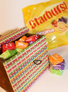
In today's shoot I wanted to begin exploring the food theme that I will be developing the most thoroughly in this advertising unit. I decided to just photograph sweets today, experimenting with presenting them and altering the composition. I captured these photographs at home, so there was no studio set up or specific lighting that I used, just a single spot light and my camera. I was extremely pleased with how they came out after I'd tweaked them slightly in Photoshop, and have acquired a lot of inspiration from photographing simple brands like Skittles. I took pictures where the sweets filled the frame, which I will be doing more of in an upcoming shoot enabling me to creating a bright and colourful multiple imagery piece. I also took pictures of the packet's contents (for example, Skittles) scattered around the frame with the packet on shot. I presented the sweets in glasses and boxes to add that extra appeal. I had fun starting off slowly with this topic and not going straight into editing images together, as I wanted to just simply photograph sweet treats first - and it has provided me with a good base for my next couple of upcoming shoots. 

I wanted to begin with photographing a packet of sweets that involved a mixture of colours, as this formal element is the most effective in advertising. Rather than just capturing a simplistic picture, I wanted to be creative with the pattern of the sweets so that it would make the overall composition more appealing. Pattern and shape are two formal elements that are evident in the top half of the frame, as I lined up particular coloured sweets to create an even and attractive pattern with the confectionary being advertised. I have taken this picture from an angle so that depth is evident in the frame, resulting in the Skittles packet being in focus whilst the contents of the packet is blurred. I like the effect with the skittles furthest away being the most out of focus as this makes it appear as though the pattern of Skittles is never-ending in the distance way beyond the frame. The overall piece in my opinion is effective because the brand is being conveyed to the audience along with the amount of sweets you get inside on packet, and more. It's a very inviting image that would sell to me quite easily if I was craving a sweet treat. I want to experiment with different packets of Skittles with the different coloured sweets and perhaps mash it up into a multiple imagery piece. 

These two photographs above are ones that I was also happy with from this shoot, that I feel have the potential to be played around with a little more. I want to edit the two of these images into magazine style. By this I mean I want to add text to the images and maybe even the logo of the brand. In the Skittles photograph I could easily add a quote about tasting the rainbow in multicoloured letters to compliment the colour of the sweets. In the Kinder image I could just simply add the logo 'Kinder' into the top half of the frame. All these types of additives to the compositions would finish off the advertising photography, as this involves text as well as images. My reasons for choosing these two pictures as ones that I could add text to is because I have taken the photographs and purposely left quite a large amount of white background in order to leave room for the text. The images just don't look quite finished with, but they will be once I alter them. 
Progression
In order to progress this shoot, I will be adding text to some of the frames like I mentioned above and also adding some surreal photoshop effects to the pictures, or new upcoming pictures, to make the images more appealing and wacky. An example of this would be me photographing a packet of skittles with them bursting out the top of the packet - created through photoshop of course.

Thursday, 19 November 2015

Work Diary - Shoot 4

Evaluation

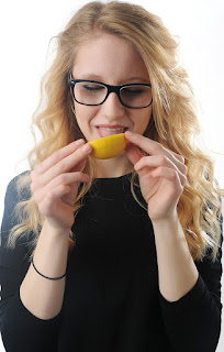
In today's shoot I wanted to practise with the composition and studio set up that I'd use when I come to photographing portraiture photography with a variation of fruits. For this shoot I have drawn a light diagram to convey how I set the studio up and what worked the best. I experimented with gels, however the colour yellow didn't compliment the picture by matching with the yellow lemon, instead it just ruined the image as I preferred Danielle's blonde hair at it's natural colour to avoid having there be other focal points in the frame; I just wanted the lemon to be the main subject of the picture. Overall I used three lights in this shoot to create the bright appearance that advertising photography often has. I will be using this set up again when I capture more portraiture photography as it was very successful. By shining a light on the white backdrop, it changed the appearance of its colour in the frame. With just a soft box to light the front of Danielle, only a minimal amount of light managed to reach the backdrop, meaning it appeared grey in the image. Therefore using the spotlight enhanced the white tone of the sheet, allowing it to become visible in my photographs. I used a snoot on the spotlight in order for it to shine on the back of my subjects hair from the right, rather than spread across the whole of my models hair. My intention for this shoot was to capture the reactions that people express after they've tasted a lemon. Here I am advertising something with a lemon flavour, which I will now be able to develop by adding a photograph of lemonade to the images perhaps.


This image is one of my favourites from the shoot today for an assortment of reasons. Firstly, I was happy to use no gels in this shoot because the texture and delicate appearance of Danielle's light blonde hair looked more appealing than it did with the bright yellow beam shining over the right side of her. The gel made the photograph look extremely fake and over the top. I composed Danielle's body to be in the middle of the frame, with her arms practically identical either side. The framing looks neat and tidy, and the lemon is in the centre of the image acting as the main focal point. It's bright yellow colour reaches out to the audiences eye, and as this is the action taking place in the frame, it conveys that what I am advertising most certainly has something to do with this tangy fruit. I thought that the black jumper Danielle wore contrasted effectively with the white background, as both colours appear as blocks. There are no tones in her jumper and no tones in the white backdrop. Sometimes a missing formal element can be a positive thing. I also like the fact that I could now develop this image into a magazine advertisement by perhaps having a bottle of Schweppes lemonade in the bottom middle of the frame with a wacky slogan.

This is my overall favourite photograph from today. Immediately I am attracted to this image because of Megan's sharp and accurate reaction to the taste of the lemon. In comparison to Danielle, Megan has gone all out with eating this lemon. Her reaction is a lot stronger because she has bit into the fruit whereas Danielle simply tried out the flavour with a small lick first. Megan's arms are also identical either side and she is situated, again, in the centre of the frame. As a result of this, the composition is successful.The orange tones in her hair and the highly saturated yellow of the lemon alongside the royal blue of her top are all colours that compliment each other. They contrast with one another but also match extremely well. It is the colours in this piece that I admire so much, as they have the connotation of fun and they are also loud. The taste of the lemon is most certainly a loud flavour because it hits your taste buds, and if I was to look at this piece in a metaphorical way I would suggest that the fun colours are a  representation of the fun adventure your taste buds undergo when they come face to face with a lemon.

Progression

In order to progress from this shoot, I will be developing these photographs. I will mainly work on those that I took of Danielle, because a bottle of lemonade/lemon flavoured drink would fit the best in the middle of her arms at the bottom of the composition. The bottle would also stand out against the black colours of her top. I will also be progressing this idea into a further shoot, where I will have the colours of the fruit match the colours of the models top, hair accessory, nail varnish and eye shadow. I want to perhaps take more photographs like this (above) of different people with the same fruit, or the same person with different fruits. I will create a multiple imagery with these pictures as it would illustrate the different reactions people have towards certain fruits. I could also have somebody messing around with the fruit in the frame and put these into a multiple imagery as well, because they would be fun to shoot and present. 

Contact Sheet - Shoot 4


Straight Images - Shoot 4


Thursday, 12 November 2015

Work Diary - Shoot 2

Evaluation

I decided to capture my first product shoot this lesson, basing it around perfume bottles (ghost, 1D Our Moment and body shop's vanilla mist). The reason that I chose these bottles to photograph is because the colours are related in a sense that they all have a clear see-through packaging, and the beige colours mix successfully with the pinks. The Ghost perfume and Our Moment mix the best with their pink tones, however I feel that all three of them with each other are just as effective because the colours are subtle and blend effectively. For this shoot, I built it. My set-up consisted of a table with two lights either side of it. One of the lights was a beam with a snoot facing down on the table. The other one was a soft box looking up at the table. I began with only one light switched on, which wasn't doing very much for the composition's lighting as it was filled with too many shadows. I then turned two lights on, however there was still a shadow at the back of the paper. I then made the infinity curve of the paper that I used less evident so that the whole image conveyed there being no interruption in the white backdrop. I had to experiment with the strength of the lights as it made one of my images bright white, so I ended up having the camera settings set to iso 200, 1/125 F11. I also used a flash, which enabled me to shoot clean and bright photographs, emphasising the femininity and glamorous appeal of the subjects in my pictures. During this session, after using gels in the previous shoot, I employed this technique into my shoot this time to experiment with colours. I used a pink gel which set a feminine mood in the frame, I used a yellow gel which added to the appearance of warm lighting, and I also used a dark blue gel which added a crystal clear and fresh appearance. I enjoyed experimenting with these gels, however feel that I could just explore with an assortment of colours on Photoshop by using the colour balance edit. Gels are fun to experiment with, however not always necessary. 

These two were the first couple of pictures that I took after developing the shoot, by building the lights and the set. I experimented with composition here, as I wanted the smaller bottle located in the foreground of the frame in order to attempt having the Ghost perfume bottle in the background appear smaller than it realistically is. In the photographs, it looks as though the Our Moment perfume bottle is pretty big, when in reality it is a lot smaller than the Ghost bottle. I aimed for the lights to create a shadow coming from the bottles to the front of the frame because I feel that this adds extra drama to the image, as it outlines the bottles' shape a lot more than it would if it was a clean white image. I was also exploring the formal element form as well, which resulted in these photographs being two successful outcomes. My reasons for pairing these two images together is because I have used a different gel in front of the light each time and I wanted to compare the two. In the left image I used a pink gel, and in the right image I used a yellow gel. These gels set different moods, which is a technique I find extremely interesting. In my opinion, the pink gel photograph is a lot more effective, because the colour compliments the already existing pink in the front subject and background subject. Additionally, the colour adds to the femininity in the composition, which relates to the product as they are both aimed at women. With the yellow gel, it made the bottles appear quite mucky and less pristine, therefore a less effective photograph.

This is another photograph from this shoot that I captured, and was extremely delighted with.  I wanted to take a photograph where all of my perfume bottles were in the same frame, because I intended on creating an advertisement displaying a mixture of present ideas for those who like a combination of scents. These would be the perfect gift for someone at Christmas, and as the season is approaching I felt it would be appropriate to relate some of my shoots to this upcoming holiday. The lighting on this photograph was glistening less, as the ones above were glistening from a light beam, however it wasn't as effective in this shoot. Despite this, I still feel that the clean white background is just as effective, as this is more magazine based. The background contains no shadows and there is no evident light source, which is the approach I was going for in the first place. Having a lack of shadows emphasises the bright and happy appearance of sweet scented perfumes. I reduced the saturation of the image in Photoshop as I didn't want the beige and pink of the bottles packaging to be too vibrant, because I was aiming for a soft appearance in this piece. I left a large white side of the background in the right hand side of the frame so that I was able to add a strap line to the piece, advertising the perfumes more verbally rather than just visually. I am happy with this first attempt at an actual advertisement, and will most certainly be developing this technique in the future.

Progression

After this successful shoot, I am extremely inspired by gel lights (even more so than I was after shoot 1)  and also extra excited for my project. I want to explore more perfume styled advertisements if I get the chance, however I mainly now just want to dig into my food based project. I will be using the same set up that I used today for the majority of my future shoots because this has proved to be a success. If I was to develop shooting perfume bottles, I would like to create more of an atmospheric set up of perhaps an outdoors background. For example, below a fresh scented fragrance is being complimented by a fresh field of green grass.

Straight Images - Shoot 2


Contact sheet - Shoot 2


Thursday, 5 November 2015

Work diary - Shoot 1

Evaluation

Experimenting with gels on lights in this shoot was tons of fun. Not only did I get to learn a new technique and put it into practise, but I was also able to discover yet another method of photography that has influenced me for my personal project. We had a set up of 4 lights. One light, coming from the top, was placed in front of the model beaming down onto them. There was then a second light (soft box) directly underneath the first light, shining up towards the model. Then we had two light beams with cones on and a filter behind the model, coming in from each side of the frame. It was these two lights that I'd then place gels over. We experimented with a variety of colours such as green, red and blue, however I wanted to capture images with the purple and yellow gels because these are both bright and vibrant. We also experimented with the lights that we'd use and the intensity of their beam, varying the strength of the lights and also turning some off to discover whether shadow pictures worked better than the bright ones. Unfortunately, I didn't manage to experiment with a different background colour such as white, but this could be something I may develop in a future shoot. I had a great time exploring the gel technique in this session and I have been incredibly inspired as a result.

This photograph of Connie is one of my favourites from the shoot. It is one of the first that I took where the yellow lighting from the left side wasn't beaming into the frame as effectively as it was later on in the shoot (I adjusted the level of the light). The reason that I find this one to be one of my favourites is because it captures Connie's mysterious facial expression in a dark light. Having the yellow there would make the image brighter, but her facial expression isn't a positive one. I feel as though I used the gels effectively in this image as the dark purple colour shining on just one side of her hair compliments her empty pose into the camera. Her eyes are also glistening in this image which adds an extra shine to the overall piece which I find quite fascinating. I really like the whole glitz, glam and shiny touch that the gel lights give to these pictures because it really enhances the frame of Connie's hair by lighting it from behind, rather than having her hair blend into the dark backdrop and not stand out in the lens. I could have perhaps added a light in front of her face to reduce the shadows, but other than that I am happy with this photograph.

This is the second photograph of mine that I captured this lesson that I was really happy with. I framed it so that the portrait consisted of no more than Connie's upper half and her face. In this image I got her to smile, because there were two lights beaming on the back of her hair from the left and right, and I wanted the bright mixture of colours to correspond with her facial expression. The light has created emphasis on Connie's hair and made all of her stand out in the frame. I think by having her leaning towards the side of the frame conveys her body language as being relaxed instead of her standing upright and forced staring into the frame straight on. By having her posture slanted creates a more calm and composed tone in the image, also making her smile appear more natural rather than it being just a forced pose. Overall, I enjoyed using these lights during this shoot because they can really bring life to a dull portrait. 

Progression

In order to excel my skills with gels and lights, I am looking to perhaps take some more pictures similar to the ones above with my own ideas. I have already planned to take photographs of a model holding sliced lemons over her eyes with yellow nails and yellow lipstick and a yellow hair accessory for example, and so on with other coloured fruits. Therefore, I am now inspired to take these exact same photos, but use red gels for a strawberry shoot and green gels for a kiwi shoot for example. I feel as though this will be a super effective technique that can enhance my images by a mile. I am also interested in experimenting with gels when I take pictures of food. An idea I have is me composing a shot of a green water bottle with a glass in front of it, filled with the contents of the bottle, whilst green gels shine in on the frame. I am also thinking of doing this with blue gels and a blue bottle, or just a cocktail glass filled with blue liquid and a slice of lemon with blue and yellow gels shining down on the frame. I think that this has the potential to work in my upcoming photography sessions, therefore I will most certainly be testing these ideas out eventually.

Straight images - Shoot 1


Shoot 1 - Contact Sheet


Monday, 2 November 2015

Photographer Research - David Gilliver

David Gilliver

Why I've chosen him

David Gilliver created the campaign "Little People" which is his area of work that I have been drawn to the most. He captures a handful of other topics, however the little people approach to his work is the most fascinating. I have chosen this photographer for this particular reason because I feel as though there is a lot of potential with this technique in my advertising topic. I touched on the little people approach slightly in my previous topic last year after finding a photographer similar to Gilliver, however I'd like to explore it in more depth during this uni. Not only does Gilliver add little people to his images, but he creates a whole setting, with action taking place all around. For example, he has people drawing a face on a pumpkin and calving it it and passing down the chunks they calve to their friends who are keeping guard on the seeds from the pumpkin. Gilliver brings life to something that has no life at all, through the use of miniature characters. He explores a variety of compositions and formal elements which adds extra diversity to his work. I feel like Gilliver could inspire me immensely throughout my project which is why I look forward to experimenting with his technique. 

This first photograph of Gillivers is bursting with formal elements, such as colour, depth, shape, form and reflection. All of these elements add to the creativity and successful appearance of this piece. What's being advertised here in this piece is the Halloween season. A store could perhaps use this type of image to create an idea for an advert, or simply use it as an advertisement at a bus stop or on a billboard to inform people of their 'cheap' pumpkins perhaps. It is a very creative piece which has been composed well, however there is perhaps too much of the reflection featured in the bottom half of the frame, the pumpkin could have perhaps been located in the centre of the frame, and a more creative face could have been calved on the pumpkin. Other than that, the use of little people calving this pumpkin has formed an extremely fun and entertaining photograph. I like the use of the black background and having the bright orange pumpkin stand out against it because this is more effective, as Halloween is a dark and spooky time of the year, therefore the use of colours in this piece are relevant and practical.

This is one of my favourites of Gillivers. This piece has been composed perfectly, and the photographic elements featured in the image are extremely effective. Having the blur smother the majority of the photograph except for the two men in the middle cutting up a yellow Smartie was a smart move from Gilliver. By doing this, it reduces the cluttered appearance of the frame because the audience have a focal point when looking at this photograph, instead of being overwhelmed by the mess and action taking place. The action has begun at the bottom of the frame, stretching out into the distance (the top of the frame). There are crushed smarties covered all over the bottom of the frame, but fresh and undamaged smarties sprawled into lines at the top of the frame waiting to be attacked. This results in having the viewer assume that even though this is a moment that has been captured, action has still taken place after this has been shot, and the top smarties have been damaged just as much as the bottom ones. It really brings life to peoples imaginations. I also like the combination of colours in this picture because it presents chocolate in the right light; colours are positive formal elements, and chocolate is a piece of confectionery that brings happiness to someone when they've been craving it for hours. 

I am finding this photograph to be extremely comical and entertaining. There is a large amount of audience that this type of picture will attract because Star Wars has evolved through many generations, therefore allowing it to attract adults, teenagers and children. Having Darth Vader sit relaxingly at a dining room table holding a box of Weetabix is rather surreal, which emphasises the humour in this piece. Weetabix is being advertised here in a way that conveys to their consumers that even characters like Darth Vader (from the dark side) eat Weetabix. In my opinion, this type of approach to Gillivers work is something that would really attract a young audience. Gilliver has also explored a number of other images featuring this villainous character along with Storm Troopers from Star Wars. He has taken his technique of little people to a different level here, and I like it. It has inspired me to use my own characters in my photography, for example, I have M&M characters that I could feature in a photograph of M&M's. I also have Minion characters that I could use for something creative. All of these ideas could be explored in my project, as a result of looking at Gillivers photography.

This is another very creative photograph of Gillivers. I very much enjoy looking at this photographers work simply because of his creative streak. Imagination is the main thing that I aim to explore in many of my photographs, having it ooze out of the frame and into my audiences memory. The composition is different in this piece, as the teeth chatter mechanism has been photographed as a close up instead of having the image be shot from the distance. The light has shone down on this image in a clever way, as it adds to the shine of the teeth, making it look as though the little people in the frame have actually scrubbed them squeaky clean, when in reality, this is just a result of lighting. Again, the black backdrop is effective as it allows the bright red gums and bright white teeth to stand out immensely. All of the little people have interesting roles as painters, working on a set of teeth instead of the walls of someones house. It's yet another fun piece of Gilliver's that I find to be, yet again, wildly imaginative and inspirational. 
How he has influenced me


Gilliver inspired me immensely by giving me the idea to employ miniature people into a frame and mix them up with ordinary objects. For this idea, I wanted to use books and people. As reading is something that can clear your mind and avoid you from thinking about any struggles/issues in your day-to-day life, I wanted to convey this as a form of escapism. By shrinking people to the size of books, I have suggested that they are closer to their fantasy of being in a fictional world in comparison to the real world. I then employed the advertising theme by adding surrealistic and fun features. In the top photograph I pasted pages of books in the background, and in the bottom frame I added a speech bubble with a quote, coming from Danielle. By photographing people with books in this artistic style, it looks more like a piece of advertising in comparison to an ordinary photograph of someone reading a book.

Summary

Ultimately, David Gilliver is a photographer that brings life to unrealistic objects and things and fires up the imagination of the viewer. He makes his photographs extremely fun, pleasant and lively which is the main reason as to why he is an inspirational man, especially for this topic of mine. His work is appealing for a variety of age ranges which is important in advertising to do with food as anyone could be interested in consuming it. Gilliver explores such a variety of formal elements that it is this fact that makes his pieces so vibrant and effective, because there is always something fascinating taking place. The reflections in the majority of his images is a very beautiful finishing touch to his work.