Andrew Scrivani
http://andrewscrivani.com/


Andrew Scrivani is a commercial photographer and director who has extensive experience in all three areas of food and lifestyle photography and videography, editorial, publishing and advertising. He is also an internationally recognised workshop instructor and columnist on the subject of food visuals. His work can be seen regularly in the New York Times. What I like the most about Scrivani's work is that it is all based around food, keeping this topic as the focal point of every image varying from starter dishes to dinners to desserts to drinks. This combination of photography provides many inspirational images for me and my topic, as I have found with this man's work a good variety of compositions I can use when photographing food myself in my project. His work is always so colourful, even if the colours aren't bright and vibrant, they are still apparent and create a vary attractive look to all of the food and drinks that he captures. It is very likely that Scrivani will be a photographer who I study in depth for my advertising project because he has truly inspired me in preparation for my upcoming shoots.
http://andrewscrivani.com/
Andrew Scrivani is a commercial photographer and director who has extensive experience in all three areas of food and lifestyle photography and videography, editorial, publishing and advertising. He is also an internationally recognised workshop instructor and columnist on the subject of food visuals. His work can be seen regularly in the New York Times. What I like the most about Scrivani's work is that it is all based around food, keeping this topic as the focal point of every image varying from starter dishes to dinners to desserts to drinks. This combination of photography provides many inspirational images for me and my topic, as I have found with this man's work a good variety of compositions I can use when photographing food myself in my project. His work is always so colourful, even if the colours aren't bright and vibrant, they are still apparent and create a vary attractive look to all of the food and drinks that he captures. It is very likely that Scrivani will be a photographer who I study in depth for my advertising project because he has truly inspired me in preparation for my upcoming shoots.
Jonathan Knowles
http://jknowles.co.uk


http://jknowles.co.uk


Jonathan Knowles is one of the leading photographers of his generation. He specialises in graphic still life, liquid and beauty, with which his unique photographic style has earned him award-winning advertising commissions worldwide; these include campaigns for many globally recognised brands, such as Guinness, Coca-Cola and Smirnoff (as shown above). He is also the creator of the famous O2 bubbles. His work is quite literally exploding with colour, and this is the most interesting formal element for me out of the ten when it comes to creating attractive and unique pieces that immediately catch someones eye. He also photographs people in his shoots along with other products such as beauty which means he is more vast in his practical work in comparison to me looking at just a food photographer. He is an extremely inspirational photographer for my project because Knowles has consistently been featured in the '200 Best Advertising Photographers in the World' books. He is also one of the top 10 all time award winners in the Graphis Annuals
Christina Otero


Christina Otero is a Spanish photographer and an artist who specialises in self portraits. She is only 19 and is the youngest artist in Spain who has ever exhibited individually in an art gallery, when she was 15. Her work varies between art and photography, exploring many formal elements such as colour, pattern, shape, form and texture. The top image is an example of her art, images that I thought about creating before I even found this artist. I wanted to create themes in my work e.g. have a model with a red lip, wearing a red top, with red nails and a red hair accessory holding a red piece of fruit (a strawberry) in front of her mouth. I wanted to do this with many other coloured fruits as well, so stumbling across Otero's work has been extra inspiration and provided me with more ideas and options that I would be able to explore through this type of creation. The bottom picture is a photograph of hers which is also inspirational, because it is filled with vibrant colours and this is the style of work I aspire to create in my advertising project.
Richard Pullar
http://www.richardpullar.com


Mary Helen Leonard
http://www.marymakesgood.com


http://www.richardpullar.com
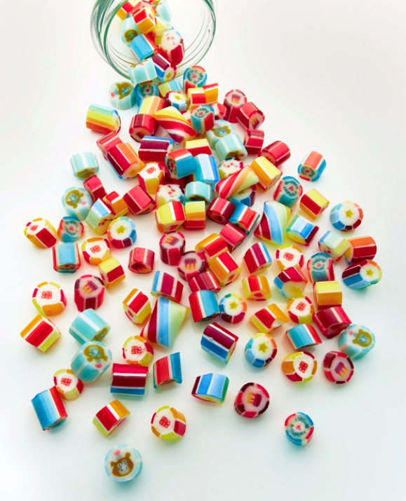

Richard Pullar is a photographer based in London who is part of Morgan Lockyer Photographers Agents. He has worked with many famous companies/brands over the years such as McDonalds, Dominos, Krusovice Beer, Pret A Manger and Innocent Smoothies etc. The top image is an example of the types of photographs that Pullar captures, varying from simple shots of sweets filled with lots of colour to creative Photoshopped pieces like the image below. Pullar has worked on many magazine advertisements which is one of the main reasons as to why I admire his work so much, because I aspire to create magazine quality pictures. He could perhaps be included in my photographer research in this project because his work is so relevant to mine and filled with advertising themes.
http://www.marymakesgood.com


Mary Helen Leonard is a Blogger who creates recipes for tasty food, remedies for people's faces and bodies created with natural food sources, along with Blogging about arts and crafts. She is a very creative woman bursting with imagination, and this definitely shows in her Blog and her work/photography. She created her own book called "The Natural Beauty Solution" with which she spoke about her beauty remedies made with natural food. Kimberly Davis was the photographer behind all of these ideas in the pictures featured in Leonard's book, and an example of these are above - the bottom two images. So her and Davis have worked together on this book, whilst the top image is just Leonard's when she is posting a Blog post on a recipe. I like the collage of two images in one like the top photograph
Kimberly Davis

Kimberly Davis is a food, interiors and lifestyle photographer for editorial and commercial clients based in Austin, TX. With this woman I have looked at more of her food based work, because here I am able to find the most interesting and artistic style for food to be captured, as this is one of the main elements in my project that I am exploring. Kimberly takes beautiful pictures of food varying from close ups of just the food to establishing shots of the food in its kitchen surroundings. I like both of these styles in her work because the ones that include just food look the most simplistic and make it more straightforward when advertising certain products, whilst the establishing style shots create depth and more of a homely natural set up instead of one that has been man made.


Scale juxtaposition - mixing tiny people with real world objects - is a technique that has been employed in the media for centuries (from Jonathan Swift's Gulliver's Travels (1726) to Honey I Shrunk The Kids (1989) to the Pillsbury Doughboy) tapping into people's general fascination with miniature things. Christopher is routinely approached by advertising and marketing brands, both large and small, to design attention-getting images to support their products. He also works with magazine and book editors on custom images for a range of publications. The reason that I have included Christopher Boffoli in my research log is because his work has a very individual flavour to it in comparison to the other photographers in this post. I enjoyed mixing small people with big things last year in my "evidence" project, so to expand and develop that idea of mine this year would be enjoyable and interesting to see how I could introduce more Photoshop techniques.
Ashkan Honarvar
http://www.ashkanhonarvar.com

Ashkan Honarvar´s collages present the human body "at the center of microcosmic theatres of dichotomy in which irrationality permeates logic, serenity belies violence, and luxury secretes exploitation. Tragically vulnerable to injury yet resilient in its ability to heal, the body itself is a living paradox: its vitality can be beautiful; its deformation, grotesque." Because I have been looking at a lot of variety of food photography in this post, I found it extremely intriguing to perhaps look at portraits of people with elements of food in, and what a more perfect photographer to choose from than Ashkan Honarvar; who makes the tastiness of sweets, a positive food, have the appearance of a negative disturbing accident. The picture above on the left looks as though that side of the mans cheek has completely fallen off, leaving behind fresh flesh. It's a very grim appearance that can only truly be appreciated as a piece of photography when the audience notice the look-a-like cut is actually combined of just sweets.
Michael Clinard
http://www.michaelclinard.com/quirky/


David Gilliver
http://www.davidgilliver.com/photography/


http://www.michaelclinard.com/quirky/


The son of an Ecuadorian mother and her Tennessee stud, Michael Clinard is a conceptual photographer from the era of 8-bit Nintendo and unsupervised bottle rocket wars. Clinard's offbeat and whimsically-infused photographic style is informed by degrees in art and art history and an interest in science, philosophy and theory. Michael tinkers and keeps sketchbooks in a home outside Seattle that he shares with his wife, three-year old daughter and a set of twins. His work is by far one of the most unique styles in this post that I find interesting and extremely intriguing.
http://www.davidgilliver.com/photography/


David Gilliver graduated from the Fine Art Photography course at the Glasgow School of Art in the year 2001, before moving to live on the beautiful Island of Guernsey in the Channel Islands. His work has received some very welcome attention over the past few years and this has led to him becoming involved in some great projects. Gilliver's work has been used both in a fine art context as well as in the commercial space. The above images are examples of his macro photography in which he includes miniature characters surrounded by a larger space; for example he has used water coming out from an Evian bottle as a pond for people to boat on through the cap of the bottle. Many of his images are like the two above which are extremely engrossing and unique, making the audience wish that they were perhaps the size of the miniature characters featured in Gilliver's macro photography. His work is similar to Christopher Boffoli's, but in Gilliver's work you see more of the character in the image as the frame is a lot closer to the subject.
Tomaas
http://tomaas.com

http://tomaas.com

Visionary image-maker Tomaas created cinematic, surreal, yet realistic fashion and beauty imagery. His edgy signature style is vibrant, dramatic and subtle. Tomaas' work exemplifies a unique photographic experience where subject matter, atmosphere and environment coalesce into a single narrative that reveals its own story. All details are equally essential in Tomaas' work. His precise vision illuminates a complete concept that creates a bold and indelible impression. Tomaas has lived in NYC for 18 years and is now based in Paris. His images have been and continue to be shown in an ever expanding number of international publications such as Vogue Italia, W Magazine, VS, Marie Claire, Qvest, Twill etc. His work has also been exhibited in several New York galleries. The reason that I've included this photographer in y research log is because his work is filled with colour and pattern and shape and character; the mixture of sweets with cutsie models is an attractive combination in Tomaas' work. The girly pink backdrop is also a common reoccurring element featured in his candy style photographs.
Henrik Bonnevier
http://henrikbonnevier.blogspot.co.uk


Henrik Bonnevier's rich still-life photography is spiced with originality. Whether cookware or other products, Henrik's photographs are always smart and perfected in detail, portraying nontraditional and delicate compositions. Henrik always creates a unique relationship with objects and products, emphasising their movement and dynamism. Henrik Bonnevier, born 1972, dreamt of a life as a skiing photographer in his twenties and later found himself creating the cover of Moby's biggest selling CD ever. His work consists of a lot of people's possessions which have been conveyed in the bottom image. There is no body involved with this image, instead just a face created with a sausage as the mouth and glasses representing their eyes.
Jeff Myers
http://henrikbonnevier.blogspot.co.uk

Jeff Myers has been in commercial photography since 1978. Based out of Houston, Texas, Jeff has learnt how to handle many different assignments, whether the assignment is in the Studio or on Location. He is comfortable in any environment, from oil rings, to corporate offices. With his photography appearing in numerous Annual Reports, Magazines (both Editorial and Advertising), Catalogues and Brochures, and having won numerous awards for his work, Jeff strives constantly to make the next shot his best. His work isn't just situated around food, but he also explores architecture, illustration and portraits. It is his food based work that I am looking at for inspiration and guidance with composition and editing, which I actually think isn't that creative in comparison to some of the food photographers in this post. His work appears quite dainty when it comes to food; he doesn't photograph an excess amount, instead he captures small slices e.g. this pie above. I like his feminine style when it comes to capturing sweet treats and the composition of his subject, and this is why his work caught my attention.
Timothy Hogan
http://www.timothy-hogan.com/#!/index/C00004N4MIuXWLP4/G0000HdYG4uiQSto/I0000LQjYdzQXvlw


http://www.timothy-hogan.com/#!/index/C00004N4MIuXWLP4/G0000HdYG4uiQSto/I0000LQjYdzQXvlw


Timothy Hogan is an award-winning commercial photographer based in sunny, Los Angeles, California. Known for his lighting mastery and craftsman's approach to the creative process, Hogan works worldwide for an array of international luxury brands and advertising agencies in the beauty, fashion, beverage and design industries. These top clients repeatedly seek Timothy out for his dramatic imagery and collaborative, easygoing nature. Drawing support from the best producers, retouchers and studios in the business, Timothy's team forges long lasting relationships rooted in the ability to problem solve with clients based on a marketing background and years of experience. His work reminds me of Jonathan Knowles' work with the splashes added into the image through photoshop.
Christophe Gilbert
http://www.pondly.com/2011/04/stunning-photography-by-christophe-gilbert/


http://www.pondly.com/2011/04/stunning-photography-by-christophe-gilbert/


Christophe Gilbert is a Belgian photographer from Bruxelles, specialized in visual art. Born in Brussels in 1962, Christophe Gilbert started by taking courses of photography to the Academy of Ixelles in the course of the evening during one year. The CCB Awards (Creative Club of Belgium), whose objective is to precede and promote the Belgian creativity, rewarded him in 2000, 2001, 2003 and 2005. Looking through his amazing portfolio of work, I'm left speechless by the way he can manipulate liquids like paint and water. Wonderfully witty as well as sexy and cool, Gilbert’s work rises above the rest with its distinct and clever style. His photography contains a large amount of nudity which could be inappropriate for some audiences, however I believe that he covers just the right amount of the ladies body parts to take the attention away from just the women's figures. I especially admire the bath photograph filled with melted chocolate as this relates to my food theme. Many of his photographs are similar to the two above in the way that they involve splashes/liquids that flow elegantly and look appealing instead of uncomfortable and gross like chocolate could look if it wasn't photographed/set up carefully.
Cathie King
http://www.cathiekingphotography.com


Josh Caudwell
http://www.joshcaudwell.com


http://www.cathiekingphotography.com


Cathie King specialises in creative portraits, travel, landscape, still life and commercial photography. The portraits that she photographs includes, but not limited, to families and pets corporate and environmental. Her commercial work includes, but not limited, to products, food, aerial and real estate. Her work is so vast and filled with exploratory ideas that I feel as though King is a very useful photographer for me to study because in my project I also want to look at food, as well as beauty, travel, still life and portraits. I like in her food photography that a lot of high key lighting is used, and there is always another creative element involved in her pieces such as the pattern/shape of the water in the top image and the reflection in the bottom image. Overall, I find King's work fascinating and very inspirational, encouraging me to study her as part of my photographer research.
Josh Caudwell
http://www.joshcaudwell.com


Josh Caudwell is a photographer of commercial advertising imagery and of fine art photography. He is based in London, UK. He produces powerful work, blending creativity, passion and craftsmanship. Josh has enjoyed a strong affiliation with art and design from a very young age. In university he trained as a graphic designer, and subsequently as a photo retoucher, before latterly coming to photography. He has since honed his photography skills by working under internationally successful fashion photographer Ram Shergill and advertising photographer Atton Conrad. This multidisciplinary background has afforded Josh a uniquely diverse perspective and an understanding of image creation to its core. He varies from creating work with make up and food/drinks which I have displayed above. The make up photography that Caudwell captures is very colourful and creative against white backgrounds allowing the bold colour of the beauty products to be the focal point of these style of images.
Hannah Whitaker

Based in New York, Hannah Whitaker studied photography at Yale and the ICP-Bard Program. She started her commercial and editorial career shooting regularly for New York and W Magazines. She has then since expanded her client list and has had her work widely exhibited. Her work is vibrant and unique; but the one above is my most favourite photograph of hers. It links with my advertising project extremely because food and other elements (nail varnish) have been blended into one image. The mixture of colours in this piece have been used exceptionally well and the high key lighting technique allows for there to be no unattractive shadows featured in the photograph. The combination of orange and pink colours was a smart idea from Whitaker because these colours represent the tones in a fruit punch, which would then pair perfectly with the use of a hand holding the orange in a slight fist shape; visually illustrating a fruit punch. She may be included in my project as inspiration because I admire her work and find it extremely fascinating.
Steve Kraitt
http://www.kraitt.com


http://www.kraitt.com


"I always believe a good photograph is like a good joke. If you have to explain it, it just isn't that good" is something that Steve Kraitt said. I love this quote, and I love his work, and I find that Kraitt is a very artistic outgoing photographer who creates an endless amount of intriguing photographs with just the use of women's mouths. He is a fashion and beauty photographer based in London, England specialising in advertising, commercial, editorial and conceptual photography and hi-end digital retouching.The pictures of his that inspire me in my project are the ones that involve food e.g. the watermelon above and the candy burger. There are either pictures where the focal point is of an object in someones mouth, and it's just the lip outline that fills the frame, or there is more of the persons body involved in the frame with again, the use of an object with someones mouth.


Sonia Rentsch has a very consistent surreal theme in her work, which is one of the main aspects that drew me towards her art directory talents. Her creations are all bursting with imagination and fascinating ideas that I have a real taste for when it comes to admiring photographs. As my project is based around advertising, I think that it is extremely important for a product to be photographed or Photoshopped in an extremely artistic way, which is exactly what Rentsch does with her pieces. The two pictures of hers that I have featured above are my favourite style of hers because it shows the main important parts that someone needs to see (the plate of food, a topping for it and a drink) in order to be attracted to purchasing something, or in this case, visiting a certain restaurant perhaps. The plain backgrounds allow for the subject of the pieces to be the focal point in all of her photographs. She may be a photographer that I include in my project simply because of her individuality when it comes to commercial photography.
This research log provides a really thoughtful look at documenting creative processes, which is such an important part of understanding how and why our work evolves over time. Taking notes, testing ideas, and reflecting on results helps improve skills and build confidence in your photography and visual projects. One major part of achieving consistent, high‑quality images is having a well‑organized workspace and proper lighting setup, especially if you are shooting products or still life. For anyone who needs guidance in that area, this detailed article on
ReplyDeleteHow To Setup A Product Photography Studio
offers helpful step‑by‑step tips for arranging lights, backgrounds, and equipment to create professional results.