Evaluation
For shoot 9 I was inspired by Christopher Boffoli, to
manipulate people and put them into surroundings that they wouldn’t usually be
involved in. He uses characters, however I wanted to use real life people and
adjust their sizes on Photoshop. I used the studio to capture the photos of
myself and Danielle, and used my home set up to take the photos of my books,
along with capturing segments of my bookshelves. I used the white backdrop for
the studio shoot and pulled it down to the floor to create an infinity curve,
same with the A1 sheet of paper I use at my home set up. I used two lights in
the studio, both facing Danielle, and a flash on my camera connected to one of
the light boxes. This lit up her characters well enough for it to look clear in
an image that I piece together, instead of having her body lit dimly against
brightly lit books. I used the quick selection tool in Photoshop, and the
transform tool, to select and adjust the size of each person I was cutting and
pasting. BeFunky.com was also a website that I included as part of the editing
stage of this shoot as this website features many creative illustrations
suitable for this shoot of mine. I was overall pleased with the outcome of this
shoot, as I produced some extremely inventive and surreal pieces which was
exactly my aim. The advertising concept is also strong in this shoot, as I am
conveying a variety of genres to whoever looks at my photographs – maybe one of
the books will become their favourite.

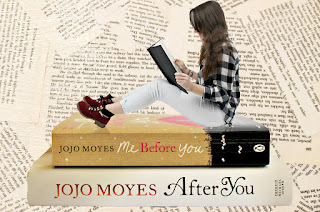
In this photograph, it is something that I pieced together
by taking 3 separate photographs and merging them into one. I took a birds eye
shot of pages from a book scattered around in the frame. I then took a
photograph of two books of the same duology stacked on top of one another, and
then one of me separately in the studio reading a book with my head down. I
took the photo of me against a white background, as this would allow my shape
to be clearly evident against the white, making it easier for the quick
selection tool to select my figure in Photoshop. I selected my outline, and
then dragged it onto the picture of the books, where I shrunk my shape using
the transform tool in order to make it look like I was around the same size as
the books. I then duplicated my body and flipped it upside down, to create a
faint reflection of my boots and legs on the laminated book cover. Here I
employed the formal element form, as I have presented myself as if I was
actually there, as my reflection proves it, rather than it looking like a false
image. After I’d perfected the piece of me on top of the books, I selected all
of it again and dragged it over the top of the sheet of pages on Photoshop. I
then altered the curves featured in this photograph and increased the sharpness
to make it appear more pristine and finished. Lots of creativity went into this
photograph, and I feel I have advertised the hobby reading in a very
interesting way. Some books that you read are fiction, which is false. It is
fiction for me to be able to be the same size as a book, however in photography
I have made that possible, enhancing the possibility of a fictional world
coming true.

This is another photograph that I have manipulated to make
my friend appear around the same size as the books she’s leaning against. I
took a photograph of books, all of different genres, standing next to
eachother, partly in the pattern black and white. The genres I am advertising
in this piece are coming of age, sci-fi, fantasy, adventure, new adult,
historical fiction and young adult. This vast variety of genres makes this
photograph appropriate for a range of audiences who enjoy reading, not just one
specific type. I selected my friend’s figure, Danielle, on Photoshop and
dragged her into the frame of the books, making it look as though she is a book
end. I then added an illustration of a speech bubble on befunky.com as I wanted
to fill the wasted space in the top left hand side of the frame. I added a very
inspiring book quote here, that reads “Everyone is a reader, some just haven’t
found their favourite book yet!” which in my eyes is precisely true. This quote
is complimented by the variety of genres being presented in this photograph, as
it is possible that one of these genres attracts someone who isn’t used to
reading. The reason that I made this photograph black and white is because it
takes away the gender specific colours of the book covers. A book that may have
pink on it would stereotypically prevent a male from picking it up, however if
the colour of these books are taken away it could allow both genders to pick a
book based on interest instead of presentation. I feel I have captured the
composition just right in this piece as there is no wasted space in the frame,
yet it isn’t too cluttered either. It could perhaps look effective in a
magazine article as the added illustration and surreal theme enhances the
creativity of it.
Progression
If I were to develop this shoot, I would like to experiment
with manipulating the size of people and putting them into food environments
like Christopher Boffoli does with miniature characters. I feel it could look
quite comical to have a picture of someone holding an apple above their head,
but them being the same size as the apple, trying to steal it from its crate.
It would be fascinating to put real life people in impossible situations,
whilst still maintaining the advertising theme.


