My Photograph

This is my photograph of a group of cupcakes that I captured. I employed the formal element pattern into this piece by placing the cupcakes in line from the back to the front of the frame rather than having them sprawled around in random positions. I mixed up the four flavours of these cupcakes to create a diverse appearance as I didn't want there to be two cakes of the same flavour next to each other. Mixing them up allows the colours to blend more effectively with each other and compliment one another. I could have used a more interesting background in order to make this piece look more complete and feel like a homely photograph that cupcakes should portray, as baking is a home comfort activity. The white backdrop however allows the confectionery to stand out with it's bold and bright colours. I used cakes that had tasty looking icing and snazzy cupcake cases because they are supposed to look appealing to the audience and entice them to purchase the product.
Online Photograph

This is an internet photograph of cupcakes that look cute and fluffy and most certainly sickly. The colours have been used well in this piece; pink and baby blue to spread a soft mood over the photograph. There are 5 cupcakes, all with fancy icing on top and an iced rose to make this confectionery appear flattering. They have been placed on a stylish dish with curved dents in the rim to match the floral shape of the icing. There is an intense blur over the background of this photograph and the back two cakes, which shows hints of pink and teal somewhere in the background, matching the colours in the foreground. I like this sense of connection because it makes the piece a lot more stronger as it's clearly been constructed with thought. The cakes look extremely tasty and inviting and if I was part of the target audience I would definitely want to buy these treats, from how they have been beautifully presented in the composition.
The Connection
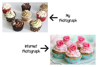

The connection between these two photographs is evident in what the subject is; cakes. Both photographs are advertising a cluster of treats, mine of different flavours and the online one of the same flavour. There is minimum depth of field in the online photograph as the very front cake is in focus whilst the two next to it and the two in the distance gradually become extra blurry the further the cakes go back. This is an effective element in the picture as it creates an even stronger blur on the background, allowing just a tinge of the teal and pink in the distance to be apparent. The cakes stand out with their bright pink icing, like the cakes in my photograph with some white icing and some pink cases. There is more of a mixture with colours in my photograph as not all of the cake toppings or cases are the same colour. Both images consist of cakes with fancy icing and toppings, emphasising their yummy taste, instead of being just plain cupcakes with one layer of messy icing for example.
No comments:
Post a Comment