Tuesday, 12 January 2016

Work Diary - Shoot 6

Evaluation and Technique

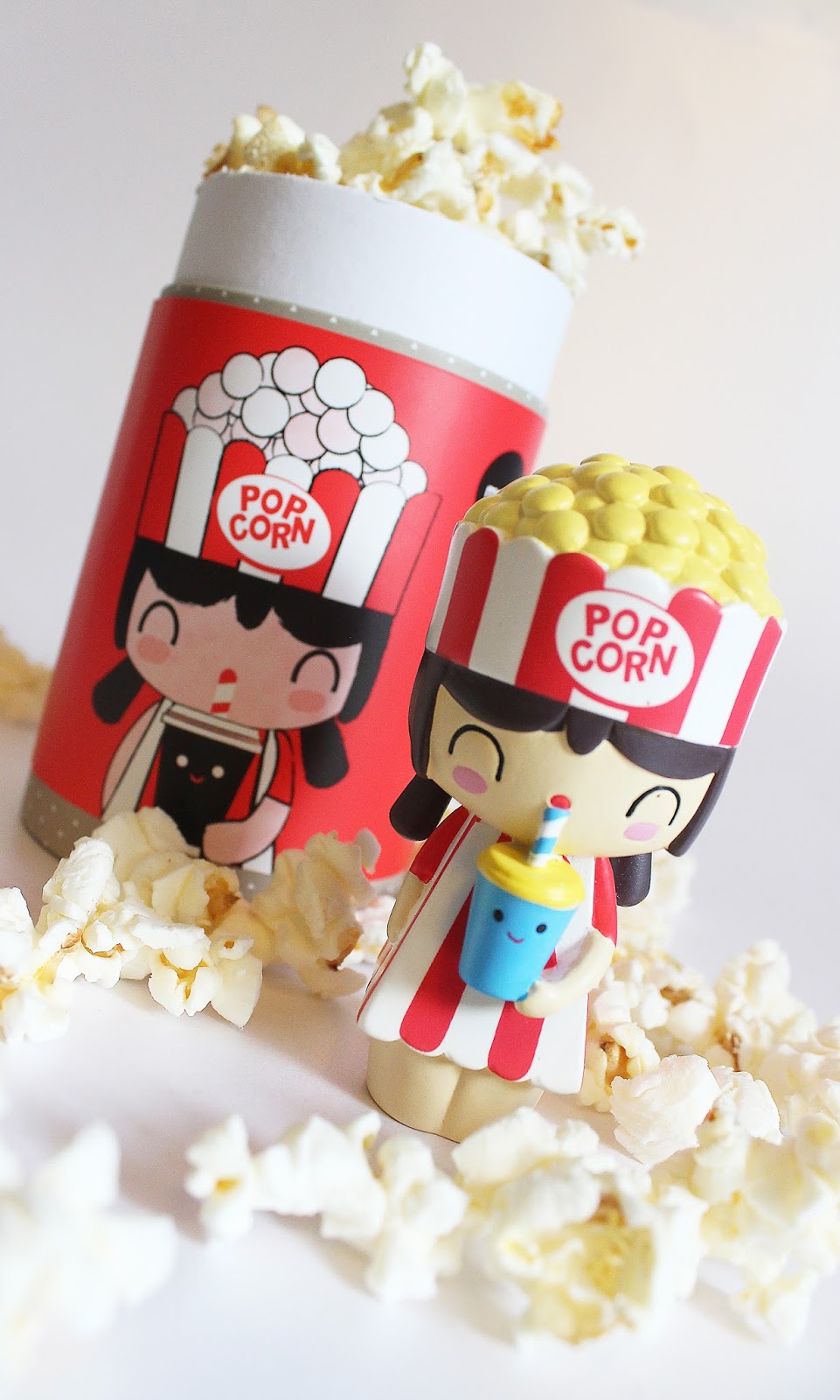
During today's 6th shoot which I done at home, I have captured a variety of food and products to advertise. I wanted to explore more of my creative side through the technique surrealism, where I employed this into the photo of my Popcorn Momiji Doll. I also wanted to experiment more with perfume bottles as this was successful in my second shoot. I found that in this shoot I was extremely inspired by a mixture of different things, such as coming up with extra ideas for upcoming shoots through relating products to food e.g. my Momiji Doll and popcorn. I now want to link products/food related to my Momiji Dolls in more shoots such as my music Momiji Dolls. On Photoshop, in order to create the below photograph on the left, I had to experiment with different layers, effects and the quick selection tool. This refreshed my memory on some Photoshop tools which I will now be progressing onto my next shoot. 


I was extremely pleased with these two photographs from today's shoot. Momiji Dolls are a brand of collectable, hand-painted dolls inspired by Asian style and contemporary illustration. They each have a small space in their base to hide a secret message on a blank piece of folded card, making a fun and special gift for anybody. They are a unique collectable item which I wanted to capture, by employing what they represent into the picture; this one being popcorn. On the left, I took a photograph of the doll with it's tub, and then a few separate photographs of popcorn on its own. In Photoshop, I used the quick selection tool to outline the shape of each piece, and then dragged it onto the picture of the Momiji Doll. I repeated this process until I was happy with the amount of popcorn in the frame. I wanted to create the illusion of the popcorn exploding over the composition, and although it doesn't look like much of a powerful explosion, I was still pleased with the outcome. After creating my first surreal piece in this unit, I will most certainly be experiment more with this technique. On the right, I wanted to compose a complete picture from a different angle, which makes the doll appear around the same size as the tub she came from. I situated the popcorn around her figure to complete the appearance of the picture.


Drifting more away from the food topic, advertising is simply also about visually portraying products to an audience in order to increase the likeliness of them being sold to customers. In this picture, I have two emoji pillows in which I have presented on a chair, grouped together on the right side of the frame. This picture allows a customer to make out the size of the pillows by having them sat on a chair in the frame. I like the white background acting as a contrast to the pillows because this allows them to stand out and keeps the feel of the picture fresh. Emoji pillows are a humorous present to give to a friend or even to buy for yourself, and they are also of good value. I left the left side of the frame with space because I was intending to add text here to make the piece look more like an advertisement in a magazine or online as a web pop-up perhaps. I would inform the customers on where to buy these pillows and how much they cost. 

Progression

As part of my progression from this shoot, I will be exploring the technique surrealism even further in order to create appealing and imaginative pieces. I will perhaps experiment with different colour backgrounds instead of just a white one as I want to shoot Innocent smoothies next week and feel that a pink background would match a berry smoothie more effectively than a white background, same with an orange background matching an orange smoothie. I will do more with the surreal technique when I shoot some sweets and confectionery products.

Tuesday, 5 January 2016

Mid-Project Evaluation

When I first started this project, I had the intention of focusing more so on just food photography. I wanted to experiment with a variety of food and drinks in my work, until I discovered some versatile advertising photographers. I found a man called David Gilliver, who photographs food products, but adds miniature people to the composition. I found this surreal movement to be extremely inspiring and something that I then wanted to employ into my work. I then found a photographer called Josh Caudwell. He photographed products such as bags and people's personal belongings along with nail polishes etc. His style is neat and precise, quite sophisticated, which is also something that I liked when carrying out my photographer research. After this I'd decided that I didn't want to just focus on food and drink, because advertising is so much more than that. I wanted to provide myself with a large window of opportunity in this project instead of a one way street down the food route alone. 

I have already explored different topics in advertising, starting from perfume bottles, developing onto locations, food, and drinks. I now want to develop onto books and reading, as this is a hobby of mine that I am passionate about and therefore want to explore in my project. I will be exploring the surreal movement more so with this topic as I feel as though it could work extremely effectively if done right. 

I have already learnt many Photoshop techniques so far in this project which I have enjoyed experimenting with, such as overlapping two photographs together, selective colour, multiple imagery, multiple exposure and the effect posterize. It has been fun experimenting with Photoshop, and is something that I want to continue exploring. I will be using the splatter tool at some point in this project as well as this was successful last year. In Shoot 1 of this project is where I experimented with gel lighting. This method added glow to a picture, which is effective in beauty photography. As beauty isn't a theme I've wanted to focus on in advertising, I haven't developed this gel technique with models, even though I did find it extremely successful. I did however develop this technique in Shoot 2, where I added pink and yellow gels to the lights that were shining down on perfume bottles - resulting in one of the most successful shoots so far.

The majority of my photographs have been captured whilst using a tripod, as this creates a still frame if I was to have a shaky hand. I will continue using a tripod for this reason. I have experimented with a few backgrounds so far, but not enough, so this is a goal I am setting for myself in future shoots. 

Overall, the first half of my project has been a successful one, with many experiments being carried out and lots of developments. In order to excel my skill in Photography, I will need to complete the recommended shoots, which is 10. As I am near to finishing the majority of the theory work, it is the practical I now need to work harder on. 

Monday, 4 January 2016

Connecting Essay 2

My Photograph

This is one of the photographs that I captured in Shoot 3 where I focused more of my work on the topic food and looked at sweet products in order to experiment with colour, as this is my favourite formal element. In my opinion, it is also the most important in advertising work because colour is something that draws a person into a certain image. I composed this piece so that the bottom half of the frame would be the Skittles packaging and the top half of the frame would be the contents of the packet. I lined them up in a pattern, another formal element, because this makes the piece appear more constructed instead of just carelessly thrown together. I lined them up in the order of their tone. For example, green matches best with yellow, which matches best with orange, which matches best with pink and so on. The skittles that are in further distance have a larger blur smudged over them in comparison to the ones situated in the middle of the frame which I find effective because it makes the focal point of the piece more evident. People's attention will mainly fall onto the word "Skittles" because it is the largest element of the photograph - a good technique used in advertising as the consumer needs to know what it is they're looking at. 

Online Photograph

This is an online photograph of The Jelly Bean Factory tub with its contents sprawled out in the top half of the frame. All of the focus is on the label of the packaging in order for this element to stand out in the frame. The combination of colours in this picture is appealing and engrosses the audience. A light has been used to shine down on the label to illuminate this section, allowing it to stand out even further. The square composition is effective in this piece because it means that only the main things needing to be advertised are conveyed; the jelly beans and the packaging. You technically don't need to see anymore of the sweets in the top half of the frame nor the bottom of the tub in the bottom half of the frame. Only the relevant elements have been captured, making it an effective outcome of the topic advertising.

The Connection

When looking at the both of these photographs, there are many similarities that stand out. Both photographs have been captured from a low angle looking across the packaging to the subject situated in the distance. Both photographs contain the packaging along with the product, with bold branding acting as the focal point in the bottom of the frame. More of the frame in my piece has however been used which makes the piece appear more complete in my opinion. I prefer the composition of my piece, having all of the frame filled with a subject, however I do like the exposed white table top underneath the Jelly Beans in the Internet photograph because this is a bright contrast. There is more evident light in the Jelly Bean photograph which makes the piece more attractive, along with the lack of bright colours. The skittles in my photograph are extremely saturated so it can be quite difficult to keep your eyes on it, despite the fact bright colours attract you to a piece in the first place.

Connecting Essay 1

My Photograph

This is my photograph that I took in my second shoot. I captured a couple of my favourite perfume bottles by composing them in the frame from different perspectives. I wanted to group the two bottles together because I feel that it makes the piece more successful as a whole. The perfume in the background is called Ghost Sweetheart, and the one in the front is One Direction's Our Moment. Both of these bottles have pink tones in them, Our Moment especially. They look extremely appealing because I have used light from the back to bounce off of the glass bottles and the glittery material in the front bottle. This light emphasises the shine on the bottles and allows them to sparkle, reinforcing their femininity. There is a shadow that comes from both bottles and grows closer to the lens rather than further away from it. This adds a sense of drama to the photograph which I find successful.

Online Photograph

This is the photograph that I found online, which is of two perfumes in bottles of the same style, but different sizes. The yellow tones in this photograph attract someones senses, as I would see this perfume as smelling similar to vanilla. Those who love this scent, would most likely be attracted to this photograph because of the impression it gives off. Their is a reflection beneath the bottles which suggests that the bottles were placed onto a laminated surface, a successful element indeed. There is a light source coming from the right side of the frame which casts shadows heading towards the left, and shadows on the left side of both bottles, more so the lid of the left one. Having the reflection and the tone/form evident in this piece contributes towards the successful appearance of this image, as these formal elements are strong and effective. The composition has also worked well as all of the focus is directed towards the bottles. The larger bottle could have been a larger focal point if the positioning of it was more in the foreground, however it pairs perfectly with the miniature version, making both products equals when it comes to the focal point of this photograph. 

The Connection

There are a large number of connections shared between my photograph and the online photograph, along with a mixture of differences. Firstly, both photographs feature two perfume bottles, however mine are from different brands whereas the online ones are of the same family. The bottles in my piece are positioned in different angles and different segments of the frame, whereas the online ones are side by side with the same angle. The colours in both photographs are different, mine appearing more fresh and appealing whilst the online one appears more warm and comforting. Despite the differences, there are evident formal elements in both photographs which make both pieces successful advertisements. There are shadows casted from both bottles due to one light source shining down on the subject with a beam, whether that be a light shadow or a dark one, it still makes both images more visually dramatic. Even though the bottles in my photograph are not of the same brand, they are still different sizes, just like the ones in the online photograph. This variation of sizes works well in the frame as there isn't too much filled up nor is there too much blank space. Overall, both photographs work as advertisements for perfume bottles and I believe my photograph is just as successful as the Internet photograph. 

Thursday, 3 December 2015

Work Diary - Shoot 5

Evaluation

When I went on a trip to Rome this year I photographed some stunning places and well known areas in this historical city. I shot some very interesting pieces and employed the formal element depth into the majority of the images I captured. This formal element is extremely effective in location photography as I learnt last year. You are able to get a feel for a place when it is being taken from the end of a road or a location further in the distance. Buildings/trees/objects surrounding the subject can be captured in the frame when you photograph depth, which is why I explore this formal element so much when I take pictures on my travels. Linking it to my advertising unit, I am able to use these types of images from my shoot and link them with the types found in holiday brochures or websites advertising the wonders of Rome. My photographs would work perfectly in magazines if someone were to review their trip to Rome and include pictures like the ones I have taken. You can advertise countries and cities to visit to death through the media, however you will never get a true feeling of a location until you visit it yourself. This is what I feel advertising photography should do if it involves a travel destination; entice people to want to visit a certain place themselves through the use of very appealing photography. This shoot was a very successful and engaging one for me that I enjoyed immensely.

Here is a photograph of the Vatican, part of the Vatican city, which is a walled enclave within the city of Rome. I wanted to capture this stunning piece of architecture from a distance in order for the beautifully lit building to be surrounded by the bright street lights at either side of the road leading to and from the Vatican. The street lights paired with the lights of the lit Vatican compliment each other extremely well as a larger majority of the frame is lit up, allowing there to be more detail and interesting features in the photograph. I shot a picture of this during the daytime but also during the night to compare the two compositions. I preferred this one during the evening because I felt that the dark sky contrasts effectively with the yellow tinted lights. If this was shot during the daytime, the Vatican would blend in as part of the structure with the buildings either side of the frame. By capturing it at night allows this unique building to stand out on its own through the use of the lights that let its structure glow. Using depth in this piece meant that I could portray an interesting perspective of looking at this building head on. It is directly in the centre of the frame, allowing of the focus to centre around the subject rather than having the viewers eyes wander. 

The majority of the pictures that I took in Rome have all been shot with the layout landscape, as this encapsulates a whole setting of a certain location rather than portrait which only really captures half. If I was to portrait this piece, there would be no silhouette of a trees leaves emerging from the left side of the frame creating a very interesting border. This is a very important part to the structure of this image in my opinion because it conveys just how far I am from the Vatican in the distance. The leaves are extremely close to my camera, nearly the size of the Vatican's when grouped together which conveys just how far away that I am. Furthermore, allowing the whole bridge to be included in the composition has allowed my photograph to capture a large amount of setting in one frame. The neutral day time colours of a cloudy but warm day in Rome has been encapsulated in this piece as the tones are gentle blues, whites and greens. This combination works very well together as the tone of the piece is consistent throughout, instead of having the segment of the leaves to the left of my frame bright orange and red. This wouldn't compliment the rest of the composition, instead it would be a very unnecessary contrast. 

Progression

Progressing this shoot isn't something that I am able to do as I am no longer in Rome, however I have also shot some holiday photos that I took in Spain this summer which I will be including in my 6th shoot next week. I wanted to explore other advertising photography in this unit, so decided that uploading some travel shoots of mine at this stage of my project would be helpful and show my versatile approach to the topic advertising. I want to develop this shoot by employing some of my pictures into the 'image within an image' technique. This will be something I do when I choose to come back and produce some developments to my shoots, as I feel it would be even more effective if someone was holding a frame and looking down on the image with a smile on their face, advertising the emotion they felt when they visited this historical city. 

Straight Images - Shoot 5